LUXURY CLOTHING XO
Branding
UI UX
Web and Mobile
Year: 2022
Client - Pota Lopez

Overview
In the recent era, especially during the pandemic, many people choose to buy things online. Lux Store is one of several applications that provide online shopping features by offering a wide range of fashion products. Additionally, users can get instant updates, track their orders, and even use their own photos to find similar items in stock through the app.
Problems Identified
From the reviews we observed:
Navigation Frustration: “The app’s navigation is really frustrating! I try to go back to the previous product page, but it keeps sending me to the homepage. Such a waste of time. This really needs to be fixed!” — Alicia Morgan, July 3rd, 2022 (App Store)
Cart Misrouting Issue: “Whenever I tap on my cart, it redirects me to the personal info section instead. Super confusing — please resolve this soon!” — Ravi Deshmukh, August 7th, 2022 (App Store)
Unavailable Items Still Shown: “So many products are listed but not actually available. It’s disappointing to browse items I can’t even buy!” — Jamie Lee, August 30th, 2022 (App Store)
Key Objectives in Understanding User Behavior on Lux Store App
Identify User Habits: Gain insights into how users interact with the Lux Store app on a regular basis — from browsing to checkout — to uncover patterns and usage behaviors.
Understand User Needs and Goals: Discover what users aim to achieve when using the app, whether it’s quick product discovery, effortless navigation, or seamless order tracking.
Uncover User Pain Points: Investigate the specific frustrations and barriers users face while using the app, including navigation issues, bugs, and out-of-stock items.
Validate Feature Requirements: Confirm which features users truly value and identify opportunities to enhance or introduce new functionality based on real feedback.
A core pillar of this project is a user-first approach to design. Every decision made throughout the process is rooted in a deep understanding of real user needs, behaviors, and goals. Through in-depth user research, the team developed personas and journey maps that guided the experience from start to finish.
The result? A product that feels intuitive, inclusive, and genuinely enjoyable to use.
To further enhance engagement, the interface was brought to life with thoughtful animations and subtle micro-interactions, adding a sense of responsiveness and delight. Every element was crafted to not only look good—but feel right.
UI Design
To achieve the project’s ambitious goals, we transformed existing UI to a mix of data and creative freedom.
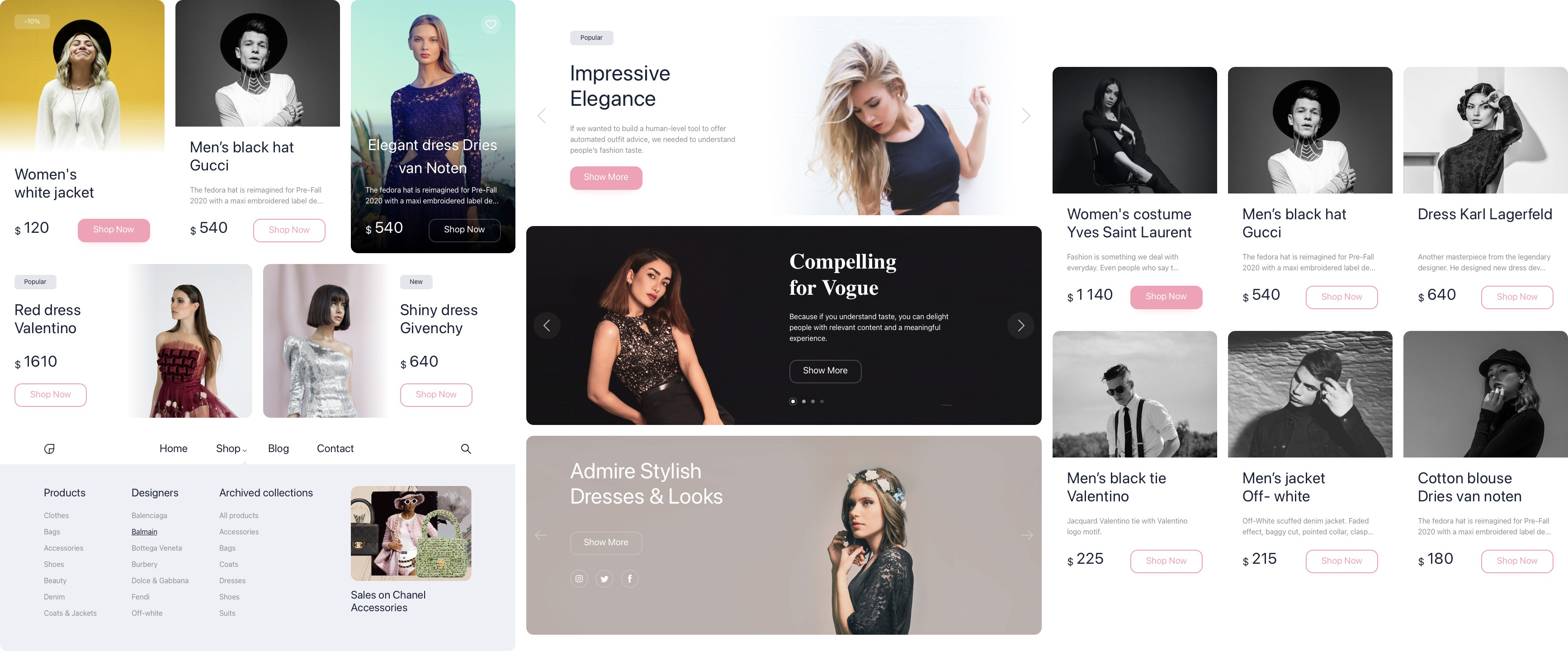
1. Homepage
The homepage has been thoughtfully redesigned for a cleaner, more organized look. Banners are now personalized based on the user’s selected gender, ensuring a more relevant browsing experience. At the top, users are greeted with banners featuring the latest arrivals, followed by ongoing discounts and exclusive promotions, all arranged in a visually appealing and intuitive order. This creates a smoother, more engaging shopping journey right from the start.
2. Item Page & Search
The item page has been enhanced for clarity and ease of use. Based on user feedback, the separate product and model tabs have been merged, as displaying the same items across two tabs was confusing and unnecessary. Now, products are smartly filtered based on the gender preference selected on the homepage, offering a more tailored shopping experience. Additionally, the search bar—previously a common user complaint—has been repositioned prominently on the homepage. This allows users to quickly and easily search for items without having to navigate away, saving time and reducing friction in their journey.
3. Categories
Create a new page with a category title, the goal is to make it easier for users when looking for categories that have been separated according to the selected gender.
4. Shopping Cart
The Shopping Cart page has been redesigned for better clarity and usability. The layout has been streamlined to eliminate clutter, making the content more visually organized. Additionally, interactive elements have been added to help users easily view, modify, or remove items—ensuring a smoother and more intuitive checkout experience.
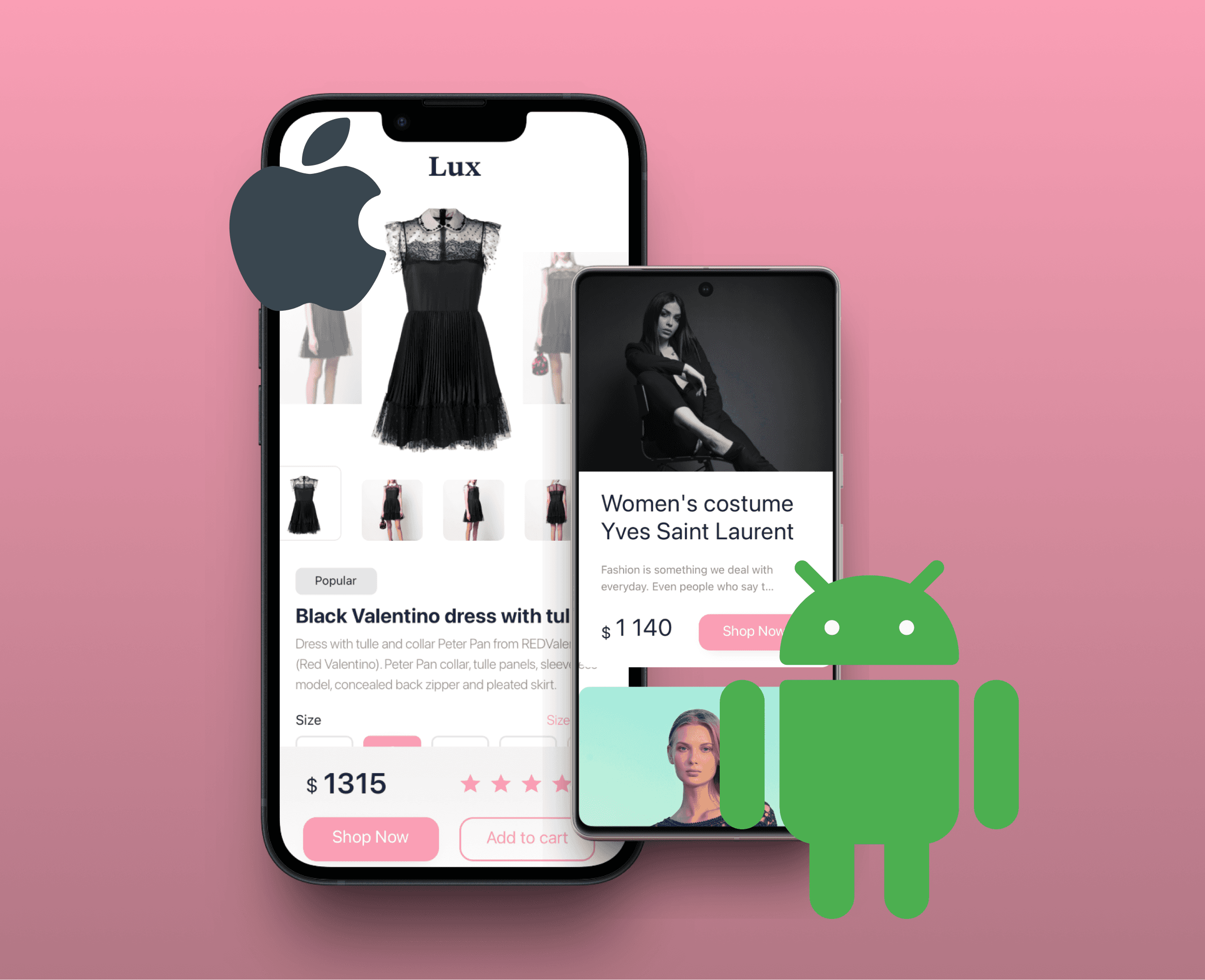
Android and iOS Application
Considering user demand, we focused on enhancing both our iOS and Android applications to deliver a seamless and premium shopping experience. In the world of luxury clothing, users expect not just beautiful products but also an intuitive and refined digital journey. Our mobile apps now offer real-time inventory updates, personalized style recommendations, high-definition 3D product previews, and secure one-click checkout options—ensuring every interaction matches the sophistication of our brand. Whether browsing on iOS or Android, users can now explore curated collections, manage wishlists, and stay updated on exclusive drops with ease and elegance.

LUXURY CLOTHING XO
Branding
UI UX
Web and Mobile
Year: 2022
Client - Pota Lopez
Overview
In the recent era, especially during the pandemic, many people choose to buy things online. Lux Store is one of several applications that provide online shopping features by offering a wide range of fashion products. Additionally, users can get instant updates, track their orders, and even use their own photos to find similar items in stock through the app.
Problems Identified
From the reviews we observed:
Navigation Frustration: “The app’s navigation is really frustrating! I try to go back to the previous product page, but it keeps sending me to the homepage. Such a waste of time. This really needs to be fixed!” — Alicia Morgan, July 3rd, 2022 (App Store)
Cart Misrouting Issue: “Whenever I tap on my cart, it redirects me to the personal info section instead. Super confusing — please resolve this soon!” — Ravi Deshmukh, August 7th, 2022 (App Store)
Unavailable Items Still Shown: “So many products are listed but not actually available. It’s disappointing to browse items I can’t even buy!” — Jamie Lee, August 30th, 2022 (App Store)
Key Objectives in Understanding User Behavior on Lux Store App
Identify User Habits: Gain insights into how users interact with the Lux Store app on a regular basis — from browsing to checkout — to uncover patterns and usage behaviors.
Understand User Needs and Goals: Discover what users aim to achieve when using the app, whether it’s quick product discovery, effortless navigation, or seamless order tracking.
Uncover User Pain Points: Investigate the specific frustrations and barriers users face while using the app, including navigation issues, bugs, and out-of-stock items.
Validate Feature Requirements: Confirm which features users truly value and identify opportunities to enhance or introduce new functionality based on real feedback.
A core pillar of this project is a user-first approach to design. Every decision made throughout the process is rooted in a deep understanding of real user needs, behaviors, and goals. Through in-depth user research, the team developed personas and journey maps that guided the experience from start to finish.
The result? A product that feels intuitive, inclusive, and genuinely enjoyable to use.
To further enhance engagement, the interface was brought to life with thoughtful animations and subtle micro-interactions, adding a sense of responsiveness and delight. Every element was crafted to not only look good—but feel right.
UI Design
To achieve the project’s ambitious goals, we transformed existing UI to a mix of data and creative freedom.
1. Homepage
The homepage has been thoughtfully redesigned for a cleaner, more organized look. Banners are now personalized based on the user’s selected gender, ensuring a more relevant browsing experience. At the top, users are greeted with banners featuring the latest arrivals, followed by ongoing discounts and exclusive promotions, all arranged in a visually appealing and intuitive order. This creates a smoother, more engaging shopping journey right from the start.
2. Item Page & Search
The item page has been enhanced for clarity and ease of use. Based on user feedback, the separate product and model tabs have been merged, as displaying the same items across two tabs was confusing and unnecessary. Now, products are smartly filtered based on the gender preference selected on the homepage, offering a more tailored shopping experience. Additionally, the search bar—previously a common user complaint—has been repositioned prominently on the homepage. This allows users to quickly and easily search for items without having to navigate away, saving time and reducing friction in their journey.
3. Categories
Create a new page with a category title, the goal is to make it easier for users when looking for categories that have been separated according to the selected gender.
4. Shopping Cart
The Shopping Cart page has been redesigned for better clarity and usability. The layout has been streamlined to eliminate clutter, making the content more visually organized. Additionally, interactive elements have been added to help users easily view, modify, or remove items—ensuring a smoother and more intuitive checkout experience.
Android and iOS Application
Considering user demand, we focused on enhancing both our iOS and Android applications to deliver a seamless and premium shopping experience. In the world of luxury clothing, users expect not just beautiful products but also an intuitive and refined digital journey. Our mobile apps now offer real-time inventory updates, personalized style recommendations, high-definition 3D product previews, and secure one-click checkout options—ensuring every interaction matches the sophistication of our brand. Whether browsing on iOS or Android, users can now explore curated collections, manage wishlists, and stay updated on exclusive drops with ease and elegance.


More Portfolio